We receive a lot of requests for a better way to look at drop times across the board and that is exactly what this consultant was looking for as well. Essentially, they want to see that feed is being dropped to the pen within a 15 minute window. She was wanting to look at this data in a graph for the past month. I believe I have submitted this request before, but just submitting it again as it is a continual request we receive.
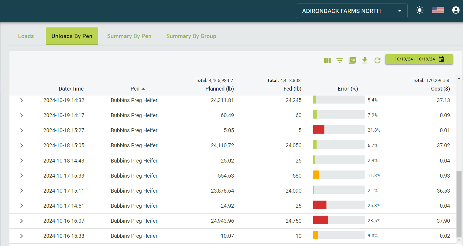
For right now, I suggested to use the Unloads by Pen under Loads and pull that data into an excel sheet and graph from there. However, the one thing that would at least make this slightly easier is being able to filter the pens they would like to see. For example, she is not concerned about the heifers at this time and would like to just see the lactating cow data. On other pages, we are able to filter by pen, but unable to on this page. I have attached a screenshot of where I am referring to.
As always, please let me know if you have any questions.
Thank you,
Amanda

